The 5 essential landing page elements every page must have
There are 5 must-have core elements on any landing page, which can be broken down further into a more detailed list of building blocks:
from http://unbounce.com/landing-pages/7-elements-of-a-winning-landing-page/
- Your Unique Selling Proposition (USP)
- The main headline (A)
- A supporting headline (B)
- A reinforcement statement (C)
- A closing argument (D)
- The hero shot (images/video showing context of use)
- The benefits of your offering
- A bullet point list summary of benefits (A)
- Benefit and features in detail (B)
- Social proof (I’ll have what she’s having)
- A single conversion goal – your Call-To-Action (CTA) (with or without a form)
The diagram below represents a sample layout with the 5 elements placed in locations determined by their hierarchical importance in terms of the story you are telling your visitors. Your specific landing page may vary from this layout, but it’s helpful to look at this for reference as we walk through each element.

1. The Unique Selling Proposition (USP)
The starting point of a marketing campaign revolves around your ability to define a point of differentiation. What is it about your product or service that sets it apart from the competition? You need to communicate this in a succinct way on your landing page. Try to break down your offering to its most basic level, to describe the specific benefit your customers will get by choosing your product/service.
A classic example comes from Domino’s Pizza: “You get fresh, hot pizza delivered to your door in 30 minutes or less – or it’s free.”
A well crafted USP sets clear expectations for your customers and allows them to understand why they should care.
The USP can be broken down into 4 page elements, which collectively tell the story of your offering throughout the landing page:
- The primary headline: the Domino’s example above is a perfect illustration of a page headline.
- Sub header: Sometimes you will need a secondary headline (typically smaller in size) that provides some clarification about the primary headline. Most commonly, this is used to allow the primary headline to be very short and punchy.
- The reinforcement statement:
- the closing argument:
1A. The main headline
Your headline is the very first thing that people will see and read. It’s critical that it very clearly describes what a visitor will get from the page (its goal) and that the message match is strong enough to show the visitor that they are in the right place.
1B. The supporting headline
Your headline can only say so much if you want to keep it succinct and easily digestible. The best way to keep your headline short and sweet is to add a supporting headline.
This can be used in two different ways:
- As a direct extension of the headline, where it follows the primary headline in such a way that it’s like finishing a sentence.
- To extend the message by applying an additional persuasive message to support the primary one. 1C. The reinforcement statement
People will scan your page when they are reading it. This makes it critical that any titles you use – such as your main headline and feature/benefit titles – throughout your page stand out to a reader.
There is another page title that you can use to drive home the purpose of your page. This is the reinforcement statement. It sits about halfway down your page, and serves to add a mid-experience message that you want to communicate to your visitors. Essentially it’s like a second headline.
Here is an example:
Main headline
The Easiest Way to Build, Publish and Test Landing Pages Without I.T.
Reinforcement statement
Create beautiful landing pages in minutes with no HTML
1D. The closing argument
As your landing page comes to a close, you have one final chance to communicate the benefit of your offering. Similar to the reinforcement statement, it backs up your main value proposition. For a click-through page, it should be coupled with a repeat of your call-to-action.
Note: For a very short page, this isn’t always a requirement as your headline will still be visible.
2. The Hero Shot
The adage “a picture is worth a thousand words” is especially true in the short attention span world of the landing page. The hero shot is the visual representation of your offer and can help people to gain a better understanding of what it is or what it looks like. For maximum effect it should show context of use . This means showing rather than telling how it will be used by a customer.
The idea here is to get your customers to empathize and place themselves in a scenario where they are using it. There are many ways in which to achieve this, including:
-
Photo(s): Consider an example of a collapsible step ladder. A standard white-background photo of the item would work for the hero shot, but to add extra effect you could provide supplementary photos of someone unfolding it, using it to reach somewhere high, and placing it neatly into a small cupboard afterward.
-
Video: While the camera never lies, video is an even more compelling way to showcase your product. Think of the common Shamwow and Slapchop infocommercials. While cheesy, they impart a sense of need by illustrating direct benefits to everyday life.
3. The Benefits
Following on directly from the USP is a more detailed description of your offer’s benefits and features. By crafting an effective headline you gained the attention of your customer, and now you have to provide a little more detail to the offer to answer any questions they may have. Try to focus on answering the question “What will this do for me?”, as this will help you to write copy that speaks directly to your customers questions.
3A. Benefit summary bullet points
It’s important to strike a balance here and not get into so much detail that your landing page feels like it’s full of text. Write a brief one paragraph summary and 3-5 bullet points for clarity. Come back to this section many times and edit the copy to remove any bloated or unnecessary verbiage.
An example, for a phone, might be:
Bad (feature based) Our new battery is twice as powerful as the competition’s.
Better (benefit based) Our new battery means you’ll only need to charge your phone every couple of days.
3B. Detailed benefit and feature descriptions
To support your brief benefit statements you want to extend the bullet point descriptions into a more detailed overview of their purpose and benefit. A good way to approach this is to expand upon the benefits first, and then if needed, add some feature details below.
The important point to remember here is that you need to communicate the benefit of your offering first. Then, and only then, do you start to add features – which are typically directed towards those who require more detail in order to make a decision.
The benefits describe the problem you are solving, and the features describe what it does.
4. Social proof
Social proof is a powerful persuasive concept. Simply put it’s the use of social signals to illustrate that other people have bought/consumed/read/participated in, what you are offering. The concept being that you are more likely to convert if you see that others before you have, and were glad they did.
Basecamp does an excellent job of showing social proof on their homepage:
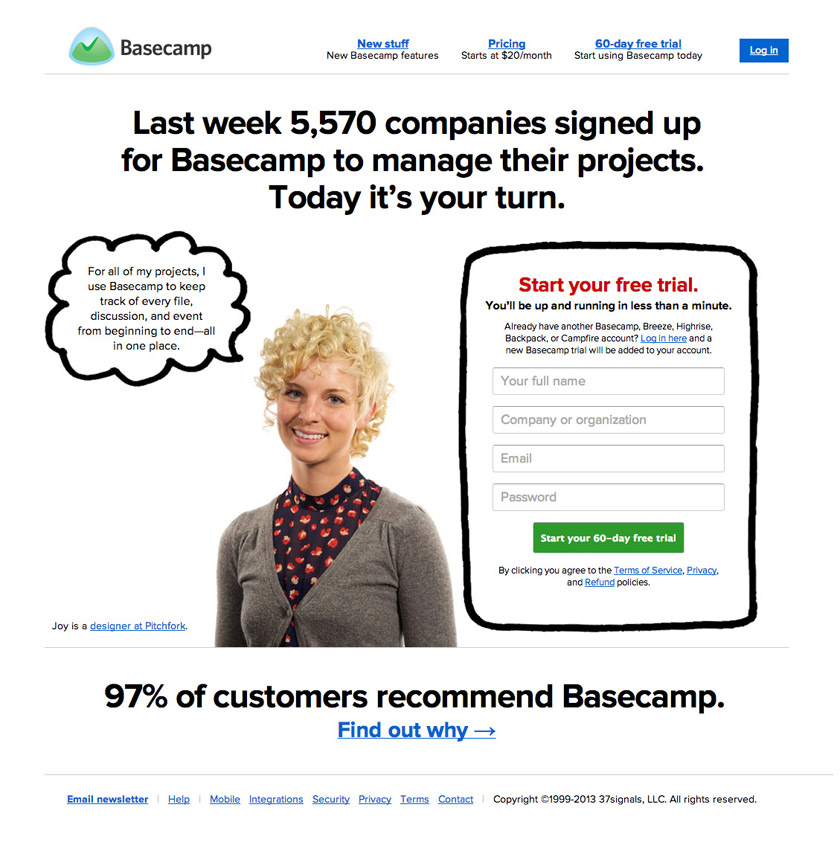
There are two key examples of social proof here:
- The headline that points out how popular they are by virtue of the number of signups in a week
-
The personal testimonial from a customer, including a link to her company for added believability Other examples of social proof are:
- Customer testimonials
- Social signals – how well received is your offering on public networks?
- A count of how many customers you have
- Trust seals to establish security of information
- Awards from reputable organizations
- Customer reviews – which are very powerful when prospects are comparison shopping
5. The conversion goal
Your conversion goal is a term that describes what the purpose of the page is to you. It’s purely a label intended to keep you focused on this page element when designing your page.
To a visitor, this is presented in the form of a Call-To-Action (CTA), which can either be a standalone button on a click-through page, or as part of a lead gen form.
Your CTA is critical to conversions as it’s the target of your pages’ conversion goal – in other words, it’s what you want people to interact with on your landing page. How you design it, where you place it and what it says are all important considerations.
It’s common – especially in the B2B marketplace – for the main purpose of your landing page to be lead generation. Usually this will involve asking the visitor for their Name and Email in exchange for a piece of content such as an ebook. If you are requesting data from your customers, keep the form as short as possible and include a privacy statement near the button or email address field.
Poorly written CTA’s are the standard CLICK HERE or SUBMIT. A good example would be “Get your $50 spa coupon” which clearly articulates what you will be receiving in exchange for your precious click.
Read about the 15 Steps to the Ultimate Lead Capture Landing Page.
Wrapping Up
By now you should have an understanding of what a landing page needs in order to function. As I mentioned at the start, you can use the 5 elements of a landing page to quickly construct an effective landing page for your marketing campaigns. One particularly good technique for visualizing landing page design potential is to create a paper prototype. Do a quick sketch of the 5 landing page elements on a piece of paper, cut them out and move them around on a new piece of paper. Try to lay it out so that they tell a fluid story with a strong focus on the CTA.